Check It Out!!

Thursday, April 30, 2009

House-shaped card (JBE051 Challenge)

I have a friend who is a realtor and thought she might like this card to give to clients when they sign their house paperwork.

This card also satisifies the criteria for Jacksonbelle Embellishments' current card challenge - to make a card that's any shape other than a square (see challenge here: http://jacksonbelleembellishments.wordpress.com/2009/04/28/tuesday-challenge-time-again/).

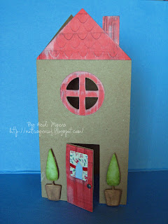
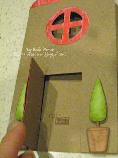
This is a Cricut Wild Card cartridge offering. So stinkin' cute! I love that the door really opens, and here I stamped "Welcome home" in the open doorway.


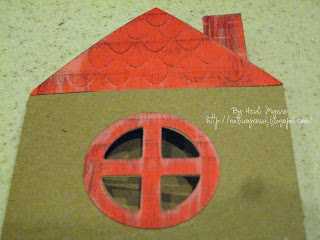
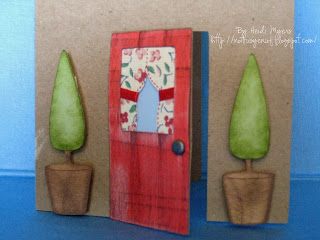
I had a great time trying to make the door, window frame, and roof look like weathered red wood. And so much fun making the curtains out of Making Memories patterned paper and some red ribbon.

I especially like the way the topiaries turned out. The ink shading really makes them dimensional and I popped them out with foam squares.


Details: Paper - The Paper Company, SU!, Making Memories; Ink - SU!, VersaMagic, Colorbox; Other - Cricut; Offray ribbon; SU! stamp; foam squares; unknown brad.

TFL!

Heidi

Don'tcha Wish Your Boyfriend Was Hot Like Mine?

I'm such a 13-year-old girl! I don't think I've ever really had a celebrity or character obsession in my (old, old) life before but damn, wouldja look at this man?? (And to think it took me two viewings of the movie to accept him as Edward. What was I thinking??!!) Hooooweeee! Team Edward!!


Heidi

Wednesday, April 29, 2009

Steph's offering Blog Candy!!

Steph of the "Where'd All My Money Go?!" blog is celebrating 10,000 hits in 6 months with some aw-ha-hasome blog candy - $100 cold hard cash (card, that is, but nowadays that's just as good)! Amazing! I aspire to that sort of traffic! Anyway, stop by her blog and give her some love. You just may be richer (ha ha) for the experience!

http://stephaniecastrodesigns.blogspot.com/2009/04/ive-reached-10000-blog-hits.html

Heidi

Jacksonbelle Embellishments Tuesday Challenge - Shaped Cards

How fun is this challenge over on Jacksonbelle Embellishments (http://jacksonbelleembellishments.wordpress.com/)? I LOVE making shaped cards, especially for children. It just gives your card that much more "credit" with the wee ones.

The first card is a dinosaur card made with Cricut PPDU and given lots of great touchy-feely oomph with the Cuttlebug and Stickles. This was for my son's good friend's 4th birthday.

Details: Cricut PPDU; Cuttlebug embossing folder; Stickles and Elmer's glitter glue; SU! cardstock, ink & markers; UniBall Signo white pen; MSE! stamp; Darice google eye

The second card is a superhero racecar card, also made with Cricut PPDU & Stickles. This was made for another of my son's good friends who was also turning 4!

Details: Cricut PPDU, Uniball Signo pen, Stickles, SU! cardstock & ink, Karen Foster Snap Stamps


See both the cards also over at the Splitcoast Stampers Members Gallery. http://www.splitcoaststampers.com/gallery/showgallery.php?cat=500&ppuser=113781

TFL!!

Heidi

Tuesday, April 28, 2009

Studio Calico NSD Challenge offering - Wish

I am really proud of this layout. I've submitted this for the Studio Calico (http://www.studiocalico.com/) National Scrapbook Day Challenge for hand-stitching on a layout (see Davinie's blog here http://davinie.blogspot.com/2009/04/in-honor-of-nsd-may-2-challenge.html) and to use 3 different patterned papers on a layout (this one has N-I-N-E on it!!) (see Nicole Samuels' blog for that challenge http://nicolesamuels.wordpress.com/2009/04/25/calling-all-scrappers-who-love-sc-kits/#comment-1954). My Studio Calico gallery can be found here (http://www.studiocalico.com/forums/galleries/show/9815). Be sure to take a look at all the offerings in the Member and Designer Galleries. There are some really talented people out there!!

The story behind my layout is that I've never really been a girly-girl and never had a really close relationship with a mother-figure, so my hope is that my relationship with Kins is how I think a mother-daughter relationship should be. (Basically, the ideal is my friend Kim's relationship with her daughter Jennifer.) So I hope that Kins always thinks of me as a friend but that she'll always be proud to call me Mama.


Unfortunately, I couldn't get a really good shot of the awesomeness that is the patterned paper that I used for this layout. It's all from Prima Marketing Inc's The First Blush Collection. It's glossy and lightly glittery. The colors are amazing IRL. So, I've included a couple different angle pics to try to pick up on this quality of the paper but have included a flatter, "matte" version to show the overall layout. I do have to say that the two pics below best show the true colors of the layout (it's a bit more orange-y than IRL on the pic above) but I felt in the pic below I couldn't get a good overall shot of the paper, picture, and embellishments. Oh, well.


I'm really proud of my handmade flowers. They're both a series of nesting circles, clipped, and then hand-sewn together. Then I roughed and inked them up to give them dimension and character.

You know me by now...gotta have me some fussy cutting, too. I've brought forward some of the flower designs that would've disappeared behind the picture. (And, by the way, don't you just love the pic. I know I'm biased but would you look at those lips?! This girl is gonna turn some heads! Daddy better get the shotgun ready! Ha ha!)

Details: Paper: Prima Marketing Inc. The First Blush collection, VersaMark ink, Barbara Trombley's Art Glitter, Stampendous embossing powder, Cricut Storybook font, SU! circle punches, Creative Memories circle cutter, Diamond Glaze, Autumn Leaves stamp, SU! ink, and I think the chipboard corner MAY be Fancy Pants, but I can't be sure (it's been in a jar for a couple years). I'm also not sure who the ribbon belongs to...I bought it like 3 years ago.
Thanks for looking.
Heidi

Monday, April 27, 2009

Paper Crafts Connection Cards & Gifts Week Mother's Day Challenge

All last week Paper Crafts Connection (http://papercraftsconnection.com/) and Moxie Fab World (http://www.moxiefabworld.com/) have been celebrating the release of their newest special publication 225 Cards & Gifts with lots of fun giveaways and a Mother's Day challenge. To see all the submissions from all the amazingly talented paper crafters out there, go to http://www.flickr.com/groups/cardsandgiftsweekchallenge/.

Stella Ruby Birds Note Card Set

My first submission is a note card set that I will be giving my mom for Mother's Day this year. I think she'll really love the colors, images, and especially the Stella Ruby Basic Grey paper. All the bird images, from a gorgeous set by Inkadinkadoo called Gem Stone Birds, are heat embossed to add that great touchey-feeley quality to the cards. All cards also include machine stitching (which, I admit, is not my forte' but adds to the homemade feel of the cards).

Details: Stamps - Inkadinkadoo Clear Stamps 98849 Gem Stone Birds; Paper - Basic Grey Stella Ruby 6x6 pad; Ink - VersaMark; Embossing Powder - Tim Holtz Distress Powder, Ink It! Embossing Powder, Judi*Kins Embossing Powder; Punches - SU!, Fiskars; Other - Carolace, thread, Halcraft blank notecards.

Urban Couture Snack Set

My second submission is a snack set I made using Basic Grey Urban Couture paper. I will be using this particular set myself. :) I love how especially this line of BG paper gives a distressed feel without all the work!

Details: Paper - Basic Grey Urban Couture 12 x 12; Other - Making Memories paint, Stickles, Mod Podge, misc. wooden boxes.

Thanks so much for looking! Leave me a comment - let me know what you think.

Heidi

Friday, April 24, 2009

3 more Hero Arts distress challenge submissions

After watching Jennifer McGuire's tutorial on the Hero Arts Blog about distress resist stamping, I had to try it. (See that tutorial here http://heroarts.com/blogs/club/2009/04/21/more-distressing-fun-and-two-videos/.) Oh, how addictive it is! I've used alcohol inks on glossy paper for a similar effect but didn't realize that all those beautiful (*gasp* unopened) Ranger Tim Holtz Distress Inks I possessed could create a similar effect on watercolor paper. I used the Hero Arts Clear Stamps "Mixed Design" set for all 3 cards.


The first one I did was the children watching the fireworks. Unfortunately, I couldn't seem to convey the fireworks background and show that the silhouette is popped up for dimension without sacrificing some quality on the pic, so I apologize for that. (Details: Stamps: Hero Arts, Rubber Stampede; Paper: SU! watercolor, DCWV The Spring Stack; Ink: Versamark, Ranger Tim Holtz Distress Ink; Unknown: mini tag, brads, ribbon, foam squares.)

The next one I did was the submarines one. I thought the background looked like bubbles underwater. There's a lot of "fussy cutting" on this one. I think this is my favorite. The combo of the colors and antiquey-looking patterened paper images reminds me of "The Misadventures of Flapjack." (Anyone have kids that watch that on Cartoon Network? My hubby hates that show. I admit, it's a bit "off".) (Details: Stamps: Hero Arts, SU!; Paper: SU! watercolor, K&Co Daydreams collection; Ink: Versamark, Ranger Tim Holtz Distress Ink; foam squares. )


The final one is the rocket. This reminds me of that Laurie Berkner song, something about, "...a rocketship in space," trying to convey the idea to kids that they can be anything they can dream. I love the colors that came through on the main image. I love the white splatter effect on the dark background paper. It's paint splattered on using a toothbrush. It looks like deep space to me. Again, I tried to show in the picture that the rocket is popped up but the dimension doesn't come through all that clearly. (Details: Stamps: Hero Arts, Technique Tuesday; Paper: SU! watercolor; Ink: Versamark, Ranger Tim Holtz Distress Ink; Misc: Cricut, Making Memories paint, EK Success border punch, foam squares, toothbrush, unknown cardstock.)

Think I'm done with the Hero Arts distress challenge for now. Now on to some others to be displayed later...

TFL!!

Heidi

Wednesday, April 22, 2009

Get It Over With!


Another distressed offering for the Hero Arts contest. Not quite as distressed as the vase card below but I used the ink distressing technique and used gorgeous Basic Grey paper which is already nicely distressed.
There's actually a coffee ring on the paper, too, in another attempt to distress it further but I guess my coffee is no match for BG paper colors! Oh, well.
The sentiment says, "Start every day with a smile and get it over with. - W. C. Fields". Sage advice, W. C. :)


Details:


Stamps - Hero Arts Clear Stamps "Mixed Design", SU! "Edgy Eloquence"

Paper - Basic Grey "Mellow", SU! c/s

Ink - Color Box Chalk ink, Versa Mark

Misc - Cricut, EK Success punch, Stampendous embossing powder


TFL!
Heidi

Woooooohoooooo! I won! I won!


I won the daily drawing at http://www.papercraftsconnection.com/ from Monday 4/20! They were doing a feature on Maren Benedict (http://www.zanynotcrazy.com/) (L-O-V-E her stuff) and she was giving away the new Paper Crafts feature magazine 225 Card and Gifts and (AND, AAAAAND) the Unity Stamp Co. Tiny Trinity stamp set (http://www.unitystampco.com/stamps?search=tiny+trinity). I have been stalking the Unity Stamp Co. Thursday Blog Hop since it started but I've never been able to participate because I haven't been able to afford a Unity set yet. I almost broke down last week and purchased the Tiny Trinity set. But now I've WON it! I can't wait until it arrives!!


OK, so yes, it was a random drawing - not a card or layout contest, but darn it all, I feel over the moon! That just made my day. So wooooooooooooooooohooooooooooooooooo!

Tuesday, April 21, 2009

Embrace Life Vase

April 2011 issue

I submitted this one for the Hero Arts challenge to distress. Of course, one of my favorite card artists was hosting it - Jennifer McGuire.


The vase is much more detailed IRL than on the pic. I began by sponging on Creamy Caramel, Sage Shadow, True Thyme, & Real Rust ink. Then I stamped in Chocolate Chip Hero Arts' Conversation Dots and clear Mixed Design stamps. Then I rubbed on some more Real Rust on the Conversation Dot image and finally rolled on the Rough Texture Wheel by SU!. THEN I applied the crackle medium which muted/blended everything.


I love how the frame came out. I tore up pieces of a "vintage" dictionary page. Love how I can call a dictionary that I used in college "vintage". It's nicely browned/yellowed over the years. LOL.

TFL!

Details:

Stamps - Hero Arts & Stampin' Up!
Cardstock - SU!
Ink - SU! & Colorbox
Other - Cricut diecuts, Making Memories paint, Inkssentials Ranger Crackle Accent, SU! distressing tool, glue dots, foam squares, glue stick, vintage dictionary page, m/u pads, qtips.

Sunday, April 19, 2009

So, how addictive are these blogs, huh?

OMG! Hopefully it's because I'm just trying to get it up and running but man, I've spent a ton of time on this thing today! I knew I spent a lot of time visiting other people's blogs. Hopefully I'll get some traffic, people will like my stuff, and this will all be worth it. :)

Anniversary Card


Here's the card I made for my hubby for our 7th anniversary a few days ago. Used DCWV Green Stack, Cricut Zooballoo for the grass, SU! ribbon and punch.
I have to give props to Shelly for the Stinkin' Cute idea here: http://cardsbyshelly.blogspot.com/2009/03/love-you-so-stinkn-much.html. That is one amazingly talented woman!

Saturday, April 18, 2009

Moving Cards

I'm attempting to design a few cards for a friend that is a realtor to give as thank yous or congrats on your new home gifts.


I reallllllllly love the key card. The background is Cuttlebug. The key is heat embossed in silver.


The moving card uses Basic Grey Urban Prairie paper. I'm such a paper junkie!!


I've got a few more ideas in mind. Now that Easter and a few birthdays and varied events are over with I can get on with creating!

TFL!

Heidi

Guitar Card


Here's a card I made for the DH. The first pic is the best of the overall card but it lacks in color detail so the second shows the pearlized color of some of the parts. The strings are raised to give the card a 3D look like an actual (albeit miniature) guitar. This is a Cricut Indie Art design.

Pineappletop


All the way to Pinetop Kins kept asking, "Are we in Pineappletop yet?" The page layout is a Page Maps design from the Page Maps book. See her great website here http://www.pagemaps.com/. I tried to make the letters look like pineapple skin by inking up a Cuttlebug folder and embossing them.

OK, so obviously I'm trying to catch up on my posting here


Another pic of a Pinetop sledding scrap page. The design is inspired by the Ni Hao Kai Lan logo. Not my favorite layout but it's pretty cute so I thought I'd include it.

Friday, April 17, 2009

A favorite layout - my two men.


Here's a favorite layout - my two men sharing a moment. I think this has to be my favorite color combo right now - real red, turquoise, and white.

Detail shots of the sparkly embossed title and the hand stitched swirls.

Have to say I scraplifted the design out of an old issue of Scrapbooks Etc. magazine. December 2007, I believe.

Hello Kitty


I created this card for a friend's daughter's 6th birthday tomorrow. She loves Hello Kitty so I freehanded a pic of Princess HK. Ya think HK looks simple enough but darn if it didn't take me several attempts to get the shape of that head right - and it's still not exactly correct. Oh, well. I think it's pretty cute.

The second pic is of the inside. The large flower around "Happy Birthday" is also hand-drawn, inspired by the Heidi Grace set "Cheerful Bee". The rest of the stamps are either from that set or the SU! set "Pretty Princess" (to echo the princess HK on the front).


Opinions?

I really need to get into Photoshop and improve the quality of my pics, eh?

Heidi


Redeco of Kins's room - The Lamp

Another bit of redeco I did in Kins's room was to "big-girl up" her little lamp. The first pic shows the before - a John Lennon Real Love lamp. The second pic shows the after. The rest are detail shots. Whadaya think?


Details:
Lampshade: I traced the lampshade onto a big piece of paper and then used the template to cut some fabric I got from Joann's last year. The fabric is stuck on with Sticky Strip tape from SU! The flowers are a felt "ribbon" from the Michael's $1 bin. The rhinestones are Jewelry Essentials jewels. Both ribbon and rhinestones are stuck on with Glue Dots. I think there are 90+ rhinestones!
Base:
Die cuts: Flower "lace", bird, and mushroom - Silhouette; Butterfly - Cricut Tink cart.
Paper: SU! cardstock; DCWV Spring Stack.
Embellishments: Rhinestones - Jewelry Essentials, K&Co Brenda Walton; Flower foam sticker (bird's eye) - Adornit; Stickles; SU! Crystal Effects.
Misc: cereal or other misc. chipboard boxes (to give diecuts strength)

Redecorating Kins's room


I've been redecorating Kins's room lately. Updating it to more big-girl-y. The first pic is of a "clothesline" of favorite baby clothes of hers that I hung on a wall. The hangers were dark metal and I colored them up a bit (although you can't really tell that from the pic).